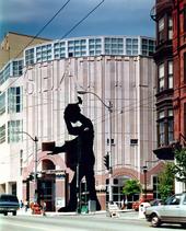
This building was designed to be a work of art – yet one that does not upstage but serves as a background for the art inside. It does not conform to the current trend of the museum as articulated pavilions but to an older tradition — going back to the adapted palaces and grand museums of the 19th century and the original Museum of Modern Art in New York — of the museum as generic loft space.
Acknowledging its context downtown in an American city, within a grid plan, and placed along a street like any other building, it derives its civic quality not by means of its special location (at the end of a boulevard for instance), but through a combination of scales — big and little. Though a relatively small building, it holds its own among the larger buildings around it through its quality of scale.
The play of small and large scale elements helps make the building friendly from the outside despite its overall lack of windows. This is further enhanced at eye level through the building’s openness and its lyrical rhythm, color, and ornament.
The rectangular order of the loft is broken at the First Avenue and University Street entrance, where the corner is rounded to generate exterior civic space and accommodate the civic sculptural figure. This works to make the museum civic and civil.
Civic scale penetrates the interior by means of the grand stair, which is visible from and corresponds to the sidewalk stair outside, and makes the building feel open and accessible.
A complex modern-museum program must serve a heterogeneous community, house educational, administrative, and commercial activities, and provide support space for services, storage, and conservation, as well as the primary space for the exhibition of art. All these can be accommodated within the generic loft system this design promotes. The flexibility of the loft space allows the Museum's various and growing collections to be displayed within cultural and physical contexts appropriate to particular art works and to the museum's diverse audiences.
Variations in structural bay size provide a three-zone organization on all levels of the building. The longer spans paralleling the north facade house bigger, more flowing sequences of spaces. Bays along the south facade suit installations requiring smaller, more enclosed spaces. The intermediate zone accommodates services and circulation and, at each end, windows where visitors can orient themselves to the city and see natural light. Vistas across the parallel series of rooms provide opportunities for cross-cultural comparisons and visual contrasts.
The curve at the corner of the building breaks the loft system inside as well as out, creating an exception to the orthogonal order and generating thereby visual and spatial tension within the spaces.
